Data Visualization Update
2014.05.26
I've made some more updates to my KenPom visualization and used it to capture a few observations (perhaps very obvious ones) from the last year in college basketball.
The visualization still isn't a masterpiece of graphic design but it's at a point where it's largely functional and I'd like to move on to some other projects for the time being. There are more explanations on the page itself so check it out and let me know what you think in the comments or via email/twitter. A reminder that the visualization is only exploratory and isn't an attempt to find correlations between the x and y axis (or the circle radius).
Three Observations
Here are some things I noticed while building and playing with the visualization, let me know if you find any other good stories in the comments:
1. Kentucky - Wichita State was the "best" game of the NCAA Tournament (and probably the whole season)
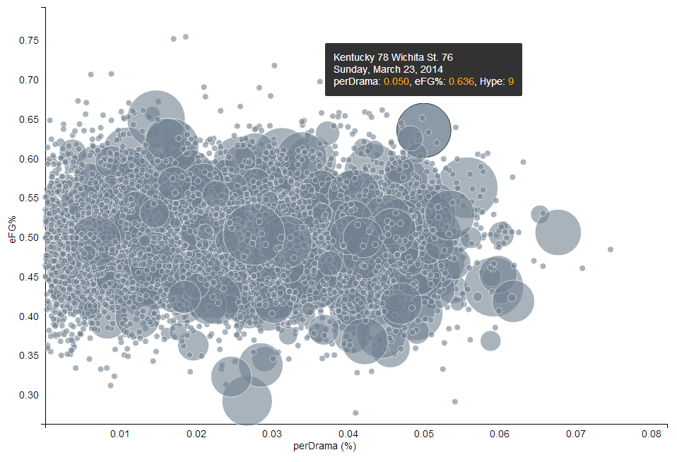
"Best" is a tricky term to define when talking about sports in general. But anyone watching this game could tell you that the numbers confirm what they saw: two lauded teams, a game that remained close throughout, and plenty of offense. The statistics don't even account for the "Wichita State can't do it against real competition" media meme which probably upped the stakes even more prior to tipoff. This game shows up in the top-right hand corner of the visualization and has a Hype rating of 9 so I was glad to see the data I was using match my experience of watching the game. Although it didn't have the highest Drama score of the tournament (that was Wisconsin-Arizona), the pace and scoring made the game a lot more compelling.
2. The Big Ten and SEC both had a particularly nail-biting March Madness
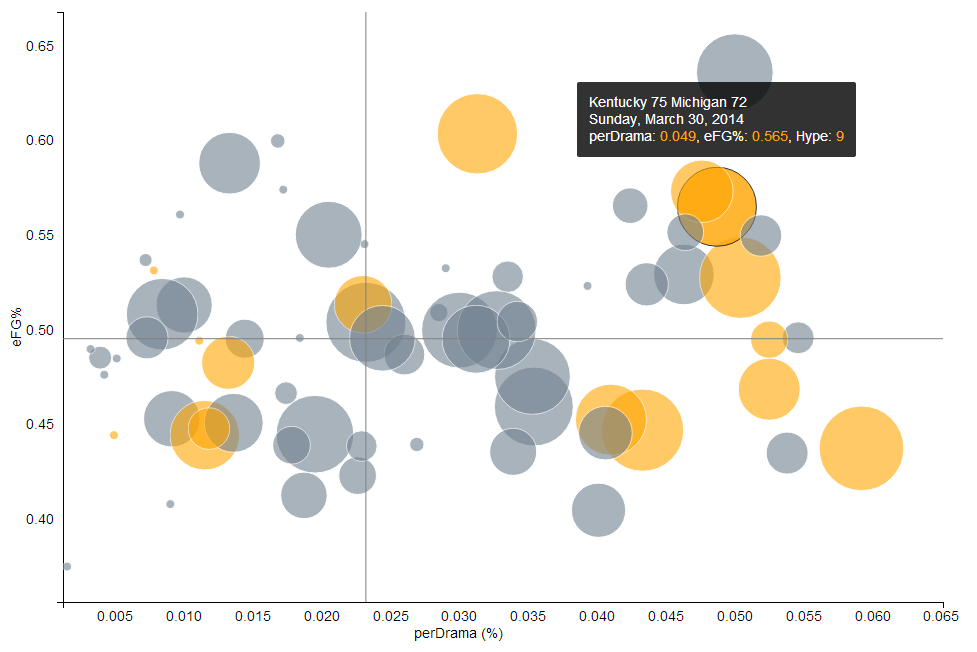
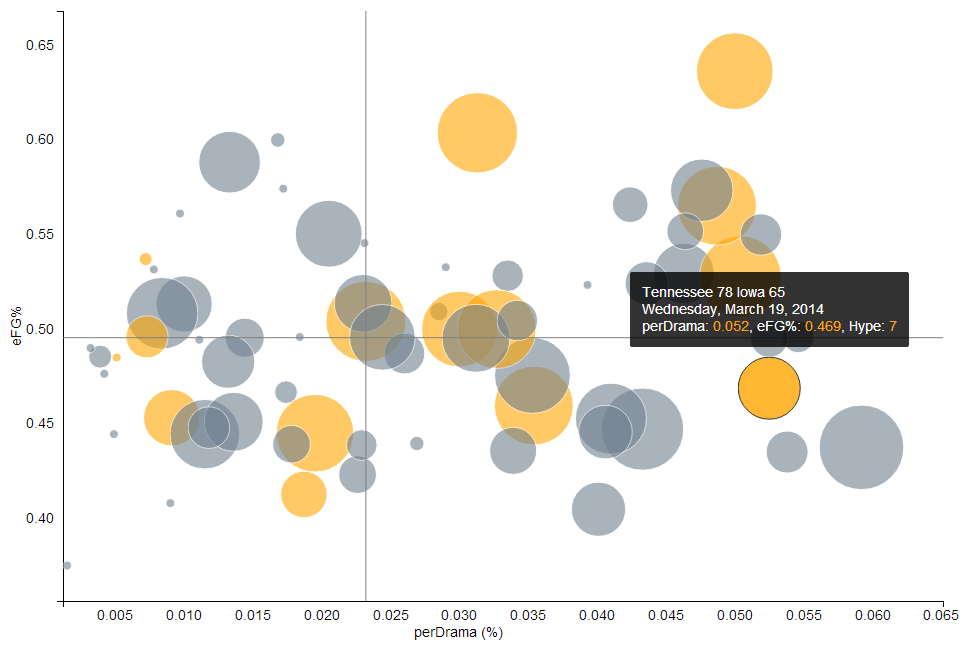
In part due to three crazy games between them (Kentucky-Michigan, Kentucky-Wisconsin, and Tennessee-Iowa), both the Big Ten and the SEC have many tournament games off to the right side of the graph (high Drama scores). I'm not positive which conference actually had the highest average Drama or eFG% but I may pull that in the future to test whether this is a purely visual phenomenon. Shout out to the A10 for having some barn burners as well despite being less heralded. Tournament darling Dayton contributed to this but also St. Joseph's, who nearly knocked out eventual champions Connecticut in the first round.
3. Syracuse - Duke (part 1) delivered on the hype
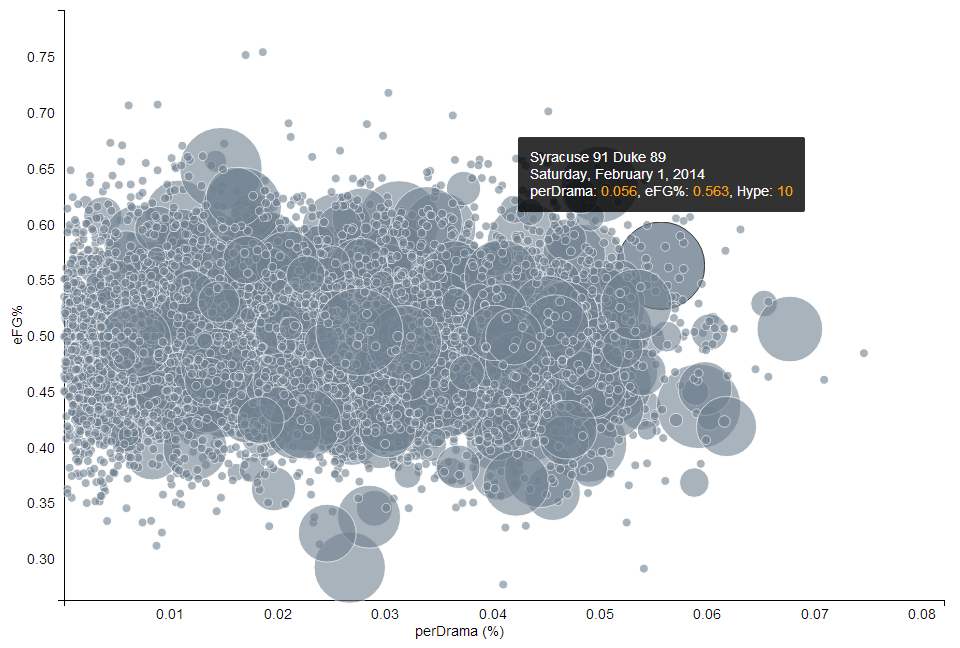
The most "hyped" game of the year, according to my somewhat flawed metric, was the first Syracuse-Duke matchup as the teams entered as the number 2 and 3 ranked KenPom squads respectively. The AP ratings were a bit more divergent (2 and 17) but I don't think anyone was exactly discounting Duke coming into this game. And according to the lede of the AP story:
SYRACUSE, N.Y. -- Coach K said he hoped this game would live up to its billing. It did, and then some.
It was definitely among the most dramatic games (top 2%) and the eFG% was surprisingly high for a Syracuse game (top 15%) making it a very noticeable large dot on the chart.